Probably the greatest accolade a copywriter can achieve is to have a slogan they wrote enter the national vocabulary.
Let’s face it: not that many people will remember who won a gold last year at Cannes. But a cool phrase that somehow ends up on everybody’s lips and lasts for decades? A slogan that will in all probability outlast the career of the person who wrote it? Well, I for one will happily take that, thank you very much.
I was fortunate enough to manage just that with my slogan for Singapore’s 1996 National Crime Prevention Campaign. And while I thought it sounded pretty good when I coined it, even I was amazed about how popular it became. Not that I’m complaining though!
Now, if only I got royalties for it…
(Apologies for the pixelation and low resolution footage. The original file source was a VHS tape. Remember those?)
When you are tasked to launch an entirely new property brand for Singapore’s largest developer, you need to find the most effective way to stand out in a very crowded market place.
(Just look at the Straits Times on any Saturday to see what I mean.)
In this case, Far East Organization had created a sub-brand called Far East SOHO. Inspired by the warehouse apartments of the uber-fashionable SOHO (South Of HOuston) district of Manhattan, these residences are very stylish, compact high-ceilinged homes in various parts of Singapore that offer buyers the opportunity to create inspiring living spaces where they live and work in a seamless lifestyle experience.
The challenge was that until very recently, SOHO (as far as most Singaporeans were concerned) actually stood for Small Office Home Office – a very commercial and distinctly non-luxurious definition.
So, not only did we have to launch an entirely new property brand, we had to redefine in no uncertain terms the very meaning of SOHO.
Clearly we couldn’t do this by following a traditional conservative property marketing approach. And, all kudos to the client, they were only too happy to venture into very unexplored territory with us.
So, at a time when other property developers were busy zigging, we zagged.
It’s no exaggeration to say that this TV commercial reinvented the way property brands could be marketed.
We pushed the boundaries on every aspect of this commercial. Carefully crafted visuals, unusual camera angles, unconventional talent casting, a cool sound track that utilised a very indie music sound and feel, and no small amount of edginess resulted in a TVC that grabbed everybody’s attention.
Indeed, everybody involved in the Singapore property scene sat up and took notice. From other developers to marketing agents to the home buying public.
Our print ads were equally striking. Again we adopted an unusual tone and manner for a relatively expensive property. Cool, desaturated imagery and unconventional talent. A high camera angle looking down that emphasised the height of the typical SOHO apartment. And apartment interiors that were carefully dressed up to reflect the individuality of each of our Far East SOHO home owners.
The brochure we created for Far East SOHO took an equally unconventional turn. We gave it a distinctly rugged, industrial appearance and, instead of the usual perfect binding, we used spiral binding – almost like a note book. For one of the centre pieces, where we showcased the spatial possibilities of double volume living spaces, the centre fold not only folded out, it folded upwards and back across to really bring across the concept of expanding SOHO spaces. Please click on the link below to see the brochure PDF.
Just what the world needs right? Another credit card.
However, in all fairness, the new Citibank PremierMiles Amex Card does offer rather cool benefits seeing as it combines the best features of the Citibank PremierMiles Card and American Express.
The concept behind our campaign was to celebrate the romance of traveling. Of discovering new places and experiences. Of creating lasting memories. Of opening up a brand new world of possibilities.
An evocative headline and a spectacular image (royalty free) that integrates seamlessly with the Citibank corporate Blue Wave background.
If I’ve achieved anything at all over the last 20 years in Singapore, it’s a certain notoriety for being a dab hand at winning government pitches.
The life blood of most local ad agencies (and not a few international ones too), the challenge is always to come up with a concept and slogan that resonates with everyone – but doesn’t lapse into the usual lowest common denominator stuff.
Obviously this is easier to say than do – but I’ve had a fair amount of success ‘doing’.
Low Crime Doesn’t Mean No Crime is the slogan I’ll always be associated with. But I’ve also come up with plenty of other successful ideas for Clean & Green Week, Senior Citizens Week, Quitting Smoking, the Courtesy Campaign (yeah, I know it didn’t work) and many others.
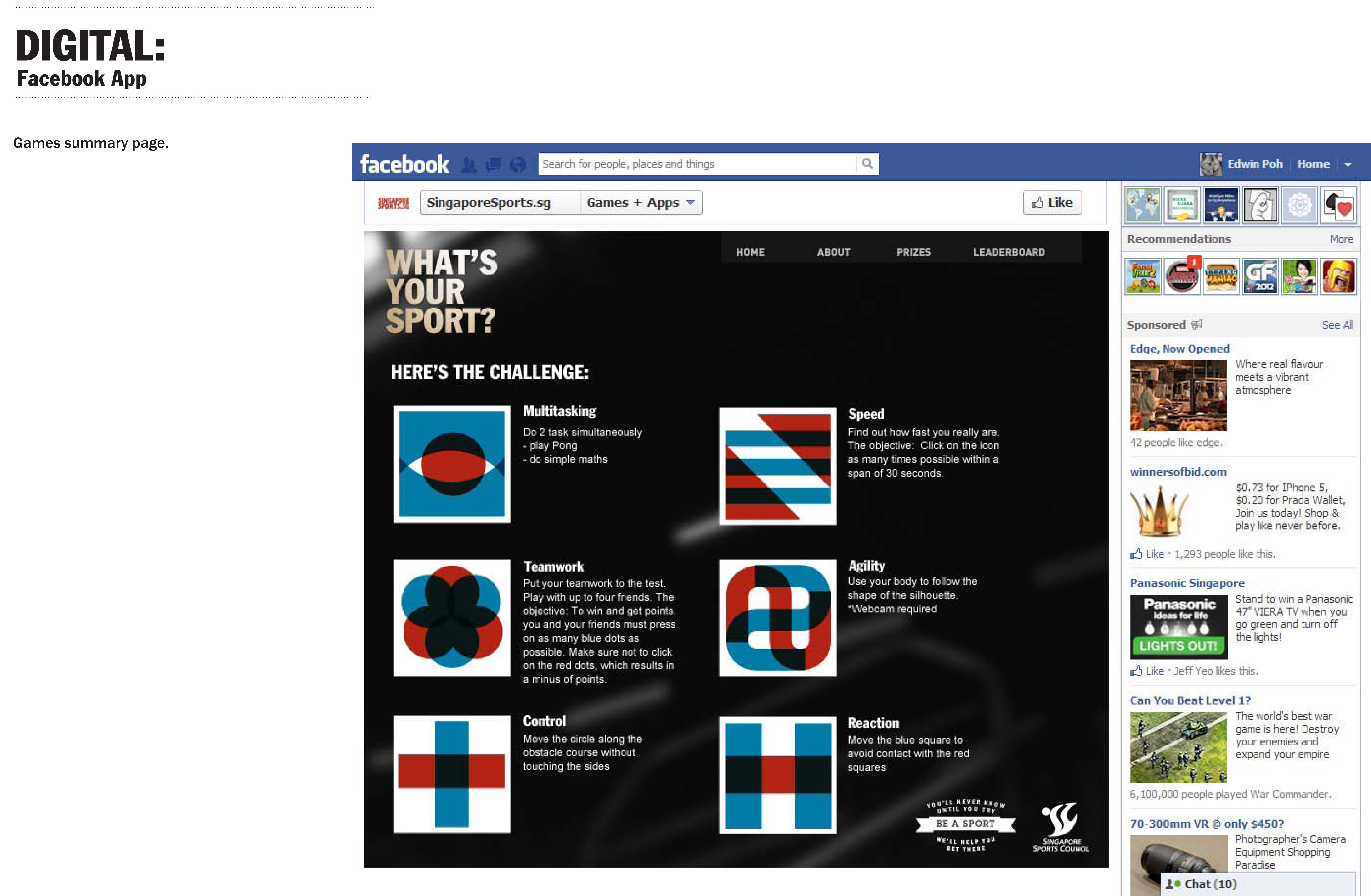
This pitch for the Singapore Sports Council (SSC) is a good case in point. The challenge was to come up with a concept and slogan that would inspire Singaporeans to take up a brand new sport.
But the fact is, most people are dubious about taking up a brand new sport because, well basically, they don’t want to make a fool of themselves.
(I know how it feels. I still have painful memories of been the very last to be selected for team sports back in secondary school.)
Our idea was simple. There are activities we do every day, without even thinking about it, that translate very easily into sporting activities.
The well groomed office lady who manages to sprint for the bus in the rain – while wearing precarious high heeled shoes. The busy executive – obviously late for work – who runs up the escalator. The coffee shop uncle who tosses empty drink cans across the room and into the bin with unerring accuracy.
All of these people are demonstrating abilities and skills that could easily be applied to sports like running, track and field and bowling.
And so we developed a series of ads that showcased examples like these.
And our slogan, BE A SPORT, captured perfectly the essence of our communication.
I personally think the work we produced was spot on.
And I’m sure the client would have too – if only our account service had managed to submit it on time…
The Scotts Tower was the very first project launched under the Far East SOHO brand. Targeted to high net worth individuals who desired a luxurious city centre lifestyle with a certain edge to it, this TVC combined traditional elements of luxury with a distinctly urban attitude. You might find it interesting to compare the soundtrack of The Scots Tower TVC with the music that underscores the Far East SOHO commercial.
The biggest creative challenge faced when marketing a property development is clearly differentiating it from its nearest competitors. So, imagine how much more challenging it is when your client is in fact competing with itself.
This was the case in point when CDL began selling off a massive land parcel in Pasir Ris in five separate stages. We had barely finished marketing Livia, their first project in the area, when we were tasked with launching its immediate neighbor.
Our concept was inspired by this particular development’s elegantly understated architecture which subtly echoed Miami Modernist Architecture (MiMo) and its well planned communal facilities which included a series linear pools and a boardwalk that had an almost catwalk feel to it.
To our minds, although this project was marketed to HDB upgraders, it imbued an undeniable sense of glamour and sophistication. We felt the best way to portray this would be to showcase the project as a place where residents would feel like movie stars.
And so we developed a TV commercial that showcased a family’s glamorous lifestyle in this condominium and a series of print ads that were designed like movie posters.
This movie star concept extended into the brochure we designed with playful elements including a plastic band designed to look like a strip of film and copywriting that played up this celebrity theme.
The concept was also extended throughout the showflat and sales gallery design and even on feeder busses from the nearest MRT station.
And then of course, the name. With its elegantly styling – but affordable pricing – this project represented a new standard for upgrader condominiums in Singapore. A New Vogue for living if you will. We shortened this statement down to just two letters and very simple but memorable name: NV Residences.
The brief for Senior Citizen’s Week 2002 was simple. Educate both the general population and older members of society that senior citizens have much to contribute to society.
Obviously nobody can really do very much about getting older. Plastic surgery can only take you so far – just ask Mickey Rourke. But over and above all the other challenges of getting on in years – failing senses, joints wearing out and so on, perhaps the biggest challenge of all is a mental one. The thought that being old also means being obsolete.
In fact, nothing could be further from the truth. With age comes experience. You learn how to deal with all the challenges that life can throw at you simply because you’ve lived through them. And that gives you the kind of perspective and, yes, wisdom, that is an invaluable resource for younger, less experienced generations.
So, with these TV commercials I refused to refer to these people as been ‘old’ or indeed as ‘senior citizens’. Instead I positioned them as people with more experience in life. This approach led to a very nice tagline that had an elegant double meaning:
What’s the best way to sell high tech digital services? Go old school analog.
That’s what I decided to do when Challenger asked me to develop a TV commercial to sell their automatic warranty service for all computer purchases.
And, because we were dealing directly with Mr. Loo, the CEO and a true-blue entrepreneur who didn’t mind taking calculated risks, the approval process was instantaneous and the whole project took less than 2 weeks to execute from concept to final delivery.
The production of this commercial was enormous fun: shooting on 35mm film stock, desaturating and adding noise and scratches during colour grading, jump cut editing and getting the composer to play his piano really badly. The budget was so low I had to pull in favours everywhere and even direct the thing myself.
But it was the talent who really made this commercial work. A Chinese Charlie Chaplin. Who would have imagined such a thing?
Property advertising, for all its frustrations, offers plenty of creative opportunities to extend a concept beyond just print and broadcast media. As a creative person I always get a certain buzz out of seeing how I can adapt and extend my ideas to all kinds of applications.
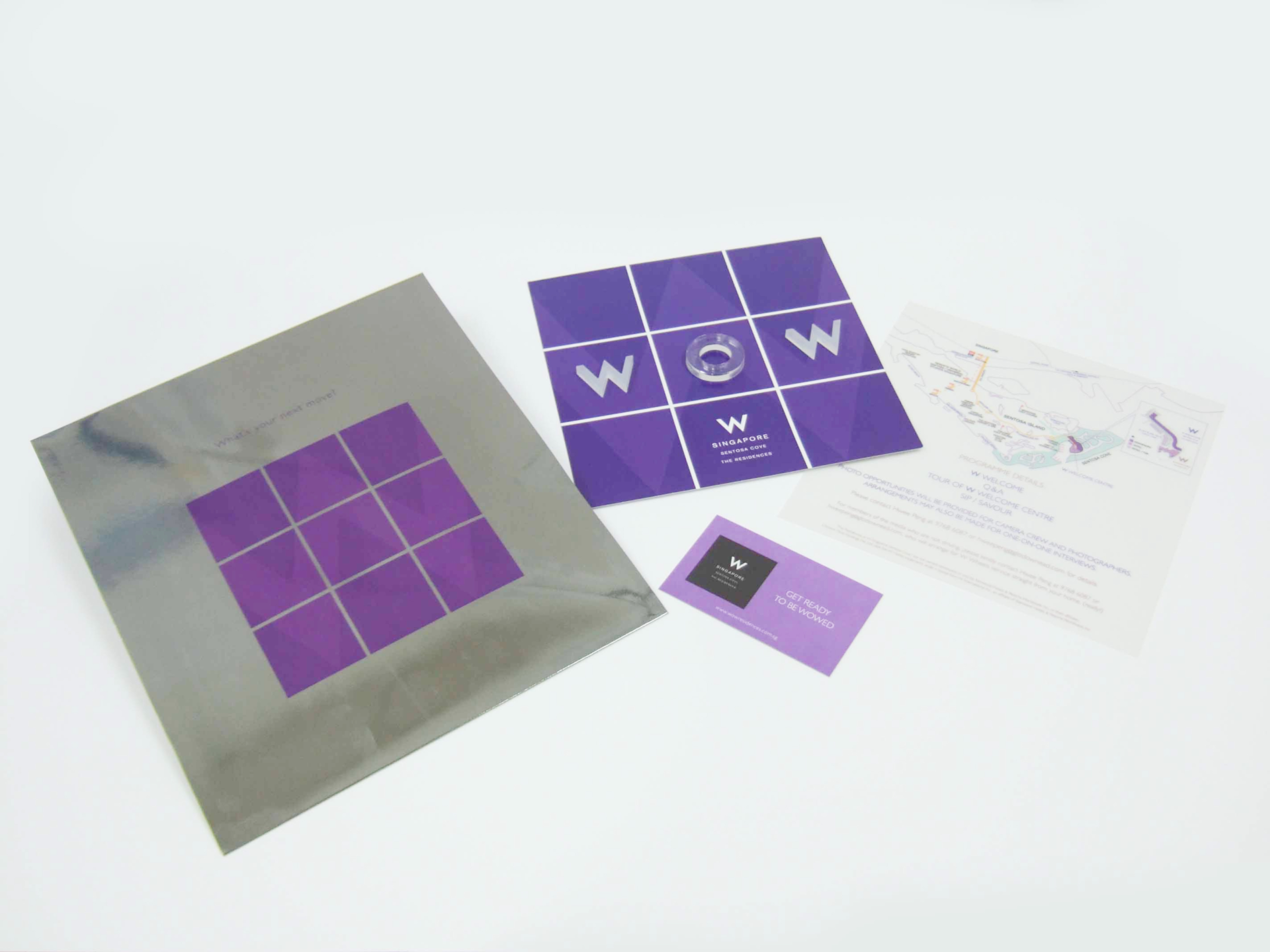
The launch of W Residences Singapore for City Developments Ltd is a good example of this.
Essentially we had to introduce the international W brand to Singapore and sell the entire ‘W Lifestyle’ to a market that was completely unfamiliar with this brand. At the same time we had to balance the corporate protocols of Starwood Hotels (who owned the W brand) with the realities of marketing an expensive property in Singapore for our client, CDL.
No easy task.
However it did give us the opportunity to have a little bit of fun and throw in some very playful elements into the marketing mix.
The launch press campaign featured a series of full page, full colour consecutive ads that introduced the W brand to Singapore, talked about W Hotels, revealed the property and finally explained the W “Whatever/Whenever” service philosophy.
Mr. Kwek Leng Beng, CDL’s chairman, loved our TV commercial and the W Residences brochure and floor plan booklets proved very popular with marketing agents.
The box containing the brochure featured a glow-in-the-dark W and a die-cut carrying handle. The brochure itself boasted a brushed metal W bookmark. There were two versions of the floor plan booklet, the only difference between them being that one had a metallic purple cover and the other a metallic silver cover.
As part of the press kit, journalists received a Tic Tac Toe game that featured a W, an O and W instead of an X and O. We also included a card that allowed them to view an augmented reality overview of the W Residences perspective.
Our colour scheme and graphic style was even extended to the on site Sales Office.
If there is one thing Singapore is known for, it’s for being clean and green. And it didn’t get that way by accident.
There’s a veritable army of cleaners and road sweepers out there every day, ensuring that everything is as close to spic and span as possible. There are also plenty of hefty fines for those foolish and careless enough to litter in the first place.
And of course there are annual government campaigns to encourage Singaporeans to take an active part in keeping Singapore clean and green. These campaigns go up for tender every year and both local and international agencies compete fiercely for them.
Clean & Green Week 2001 was no exception. That particular year the National Environment Agency (NEA) wanted to focus on recycling. And the brief was to find a way to encourage people to put things like empty drink cans, plastic bottles and papers into their respective recycling bins.
My solution was to take a very lateral approach to the challenge and get these objects to make a personal appeal to the the television viewer.
Instead of just being thrown away, if these relatively humble items were recycled, they could be ‘reincarnated’ as something much more exciting.
A mere aluminum drink can could become part of a sports car.
A basic plastic bottle could be reformed into the casing of a computer.
A daily newspaper could have a second life as a sheet of art paper.
To sum everything up, I wrote the slogan – “Don’t throw away my future. Recycle me!”
To my delight, NEA and the acting Minister for the Environment, Mr. Lim Swee Say, were very taken with this concept and adopted it wholesale.
And in the true spirit of recycling, the bottle, can and newspaper characters I created (and drew) went on to enjoy an extended lifespan for 2 or 3 years after the campaign officially finished, appearing on bus backs, stickers and post-it-note pads.