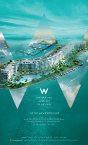
The launch of W Residences Singapore

Property advertising, for all its frustrations, offers plenty of creative opportunities to extend a concept beyond just print and broadcast media. As a creative person I always get a certain buzz out of seeing how I can adapt and extend my ideas to all kinds of applications.

The launch of W Residences Singapore for City Developments Ltd is a good example of this.

Essentially we had to introduce the international W brand to Singapore and sell the entire ‘W Lifestyle’ to a market that was completely unfamiliar with this brand. At the same time we had to balance the corporate protocols of Starwood Hotels (who owned the W brand) with the realities of marketing an expensive property in Singapore for our client, CDL.

No easy task.

However it did give us the opportunity to have a little bit of fun and throw in some very playful elements into the marketing mix.

W Residences Ad 1W Residences Ad 2W Residences Ad 3W Residences Ad 5

The launch press campaign featured a series of full page, full colour consecutive ads that introduced the W brand to Singapore, talked about W Hotels, revealed the property and finally explained the W “Whatever/Whenever” service philosophy.

Mr. Kwek Leng Beng, CDL’s chairman, loved our TV commercial and the W Residences brochure and floor plan booklets proved very popular with marketing agents.

W Residences Brochure

The box containing the brochure featured a glow-in-the-dark W and a die-cut carrying handle. The brochure itself boasted a brushed metal W bookmark. There were two versions of the floor plan booklet, the only difference between them being that one had a metallic purple cover and the other a metallic silver cover.

W Residences Game

As part of the press kit, journalists received a Tic Tac Toe game that featured a W, an O and W instead of an X and O. We also included a card that allowed them to view an augmented reality overview of the W Residences perspective.

Our colour scheme and graphic style was even extended to the on site Sales Office.

Outdoor-Sales Office

NEA Clean & Green Week 2001


If there is one thing Singapore is known for, it’s for being clean and green. And it didn’t get that way by accident.

There’s a veritable army of cleaners and road sweepers out there every day, ensuring that everything is as close to spic and span as possible. There are also plenty of hefty fines for those foolish and careless enough to litter in the first place.

And of course there are annual government campaigns to encourage Singaporeans to take an active part in keeping Singapore clean and green. These campaigns go up for tender every year and both local and international agencies compete fiercely for them.

Clean & Green Week 2001 was no exception. That particular year the National Environment Agency (NEA) wanted to focus on recycling. And the brief was to find a way to encourage people to put things like empty drink cans, plastic bottles and papers into their respective recycling bins.

My solution was to take a very lateral approach to the challenge and get these objects to make a personal appeal to the the television viewer.

Instead of just being thrown away, if these relatively humble items were recycled, they could be ‘reincarnated’ as something much more exciting.

A mere aluminum drink can could become part of a sports car.

A basic plastic bottle could be reformed into the casing of  a computer.

A daily newspaper could have a second life as a sheet of art paper.

To sum everything up, I wrote the slogan – “Don’t throw away my future. Recycle me!”

To my delight, NEA and the acting Minister for the Environment, Mr. Lim Swee Say, were very taken with this concept and adopted it wholesale.

And in the true spirit of recycling, the bottle, can and newspaper characters I created (and drew) went on to enjoy an extended lifespan for 2 or 3 years after the campaign officially finished, appearing on bus backs, stickers and post-it-note pads.

C&G

Far East SOHO’s Hillier

Hillier was the second Far East SOHO development to be launched, after The Scotts Tower. In this particular case, while another agency had developed the brochure and press ads, we were asked to create the TV commercial – which, as you’ll see, soon turned into 3 different TVCs.

Oh and we had about 3 weeks in which to get them all done.

First of all, in order to ensure some kind of continuity from the original Far East SOHO brand launch, we started off with a launch TVC with the first 40 seconds featuring the Far East SOHO brand and then transitioning into 20 seconds showcasing Hillier.

Now, although every Far East SOHO project shares similar features, they also have their own distinct characteristics and personality. So, while The Scotts Tower reflected a sophisticated, glamorous urban lifestyle, Hiller, with its suburban setting , retail centre downstairs and close proximity to the MRT, was more about offering a laidback, taking things nice and easy kind of vibe.

An additional challenge lay in the fact that Hillier was conceived as two towers of residential apartments, with each tower having its own distinct design personality. One tower was themed around a New York City styling while the other tower had a London-inspired design theme.

As a result, we found ourselves having to execute not one but two more TV commercials, each showcasing one of these towers.

These TV commercials depicted the ‘perfect Sunday at home’: Lazing around in the morning… Popping downstairs for food and shopping… Saying hello to neighbors… And having friends over for a relaxed Sunday barbecue… but as seen from  the point of view of a resident of the “New York” tower and a resident of the “London” tower. In other words the exact same day as seen from two different points of view.

The first to appear after the initial launch commercial shown above was the “New York” commercial:


This was followed two weeks later by the “London” commercial:

As you can see, we defined the very different personalities of each residential tower through our depiction of the homeowner, the way they decorated their home and the background music.

Despite the tight time frame and a certain sense of ‘Groundhog Day’ during the shoot, I was quite pleased with the results. Especially as each commercial tells its own unique story in just 30 seconds.

The Great M1/SingTel War 1997


When M1, Singapore’s second Telco, made its grand entrance into the marketplace in 1997, SingTel, the incumbent monopoly, were less than impressed.

They responded to M1’s launch with a fairly lavish TV commercial using a red (their corporate colour) umbrella to show how much bigger and stronger they were than this cheeky upstart.

Our response was to create a series of 20 second commercials using simple 3D animation to point out SingTel’s weaknesses and M1’s comparative strengths.

Of course it was all done with a gentle sense of humour… although I don’t think SingTel really appreciated it.